Making Scientific Graphs with Microsoft Excel
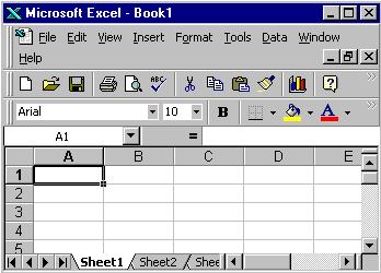
Understanding the layout of an Excel page:

- The "workbook" (spreadsheet) is divided into columns, labeled with letters, and rows, labeled with numbers.
- The columns and rows divide the page into "cells". Each cell
can be identified by its row number and column letter: "A1" in the image. Example: we will
enter the description of the independent variable into cell 1-A.
- Entering data into these cells.
- Data for the independent variable goes vertically down column A, starting with row 2.
- The description of the dependent variable goes on row 1,
starting with column B. Use additional columns (C, D, etc.) if there is
more than one variable.
- Data for each dependent variable goes vertically down the column under its description.
Adding cell information:
- Move the cursor to a cell and click. A box forms around the cell and you can now type either letters or numbers in the cell.
- Move the cursor to the next cell and click. Data is accepted by the first cell and the new cell is ready for data.
- Continue until all data is added to the workbook page.
- When finished, click on a cell outside the range of your data. This will enter the data in the last cell.
- You can also finish a cell by pressing "Enter".
Making the "chart":
- Move the cursor to cell 1-A.
- Click and hold the mouse while dragging to hilight the cells to be used to make the graph.
(You can also mark the region to be graphed by clicking on the first cell and then shift-clicking on the last cell. A separated region can be added using a ctrl-click & shift-click combination.)
- Click the chart wizard button on the tool bar.

- Step #1: Pick the appropriate chart type. A single click on a type
choice will give you a description of the type. Unless otherwise noted,
your graphs will be line graphs. Click "next".
- Step #2: The source data should be correct. Click "next".
- Step #3: There are several operations available in this step on the wizard.
- Titles - type a chart title in the space provided.
- Axes - this should be correct.
- Gridlines - for most line graphs, you will want to show the major gridlines for both X and Y axis.
- Legend - your choice here depends on the data. Check the Excel graph evaluation rubric for more details.
- Data labels - show data labels only if they will not clutter the graph.
- Data table - show the data table if there is room. Do
not show the data table if it makes your print of the graph take more
than one page.
- You can make changes back and forth in the chart wizard
without a problem. When you are satisfied with your graph to this
point, continue.
- Step #4: the chart location should be correct. Click "finish" to draw the graph.
- Changes can be made at any time by activating the graph (click
just inside the graph page margin), then clicking on the chart wizard
button on the toolbar.
- Advanced Methods: You can also edit or add features by clicking on the graph and then using the "Chart" menu that will appear on the top menu bar. Other items can be changed by clicking on them individually.
Prepare the graph for printing:
- Click just inside the graph page margin to activate the graph.
- Click and hold on one of the corner boxes, drag to enlarge the chart.
- Double click inside the colored graph area.
- All printed graphs in this class must have a white background.
- Click "fill effects".
- Click "one color". Make the color white in the drop-down menu.
- Adjust to no shade.
- Click "ok" and "ok".
- The defalt data lines can be changed.
- Double click with the cursor exactly on a data line.
- Make the line weight appropriate.
- Make the line color appropriate.
- If appropriate, click "smoothed line".
- "Marker" adds a dot at each data point.
- "Data labels": show "value" if it doesn't clutter the graph.
- Resize the graph plot area by clicking inside the plot area, then click, hold, and drag the plot area to cover most of the page.
- Click on the graph title to activate it.
- Make the font appropriately large and move the title to an open area inside the plot area. Remember, this is a "scientific" graph. Only standard font types are appropriate.
- Check the graph legend. Be sure it is an appropriate position
that does not clutter the graph. If needed, click and hold on the
legend and move it.
- Add you personal information to the graph.
- Use the "text box" to place the following personal information on the page.
- Your name
- Assignment number. (example: Assignment 022)
Printing your graph:
- Click just inside the page margin to activate it.
- Go to "file", then "print preview".
- Look carefully at your graph. Be sure everything is the way it should be.
- If you see a problem, click "close" print preview and fix the problem.
- If everything is ok, click "print".
- Save the file in science directory on your computer hard drive with the appropriate file name.
- See an example of a line graph made with Excel
Notes and Comments:
- You will almost never want to "connect the dots" on your graph. Either use a smooth curve or a "scatter plot" and add a "trend line" later.
- Most scientific graphs should have both axes starting from or including "zero".
- You can make a graph from any rectangular region on a spreadsheet. Use the top row of the region for the labels and the first column for the independent (horizontal axis) data. Then click on the top left corner and shift-click on the bottom right to select the data. Use the "Chart Wizard" as described above. Several charts can be put on the same sheet using this method.
back to Tutorials

